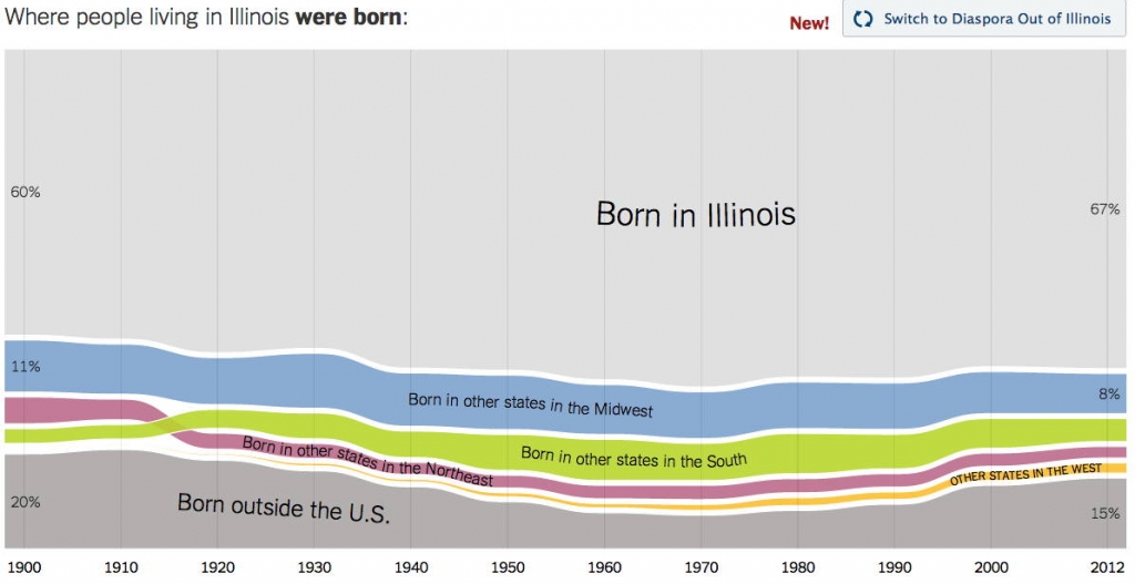
Where we came from in the United States…and where we went is the subject of today’s post. These infographics from the New York Times illustrate domestic migration from 1900 through 2012. You know I love a good set of interactive maps for genealogy research and these are fascinating.
These maps use census data to illustrate where residents of each state were born. The map can also be reversed to show where people who were born in a particular state moved. Each state has its own complexities. Epic trends, such as European immigration at the turn of the century or the Great Migration of African-Americans northward during WWII, are made visible.
Arizona and Illinois are featured in today’s post. Click here to see infographics on each of the 50 states.
The New York Times writes:
The following charts document domestic migration since the turn of the last century, based on census data. For every state, we’ve broken down the population in two ways. You can now see two views for each state: where people who live in a state were born, or where people who were born in a state have moved to. The ribbons are color-coded by region, and foreign-born residents are included at the bottom, in gray, to complete the picture for each state.
Migration can reveal the dynamism of a state’s economy or a cultural renaissance; a significant outflow can reveal the opposite. You’ll also see the interrelationship between moving in and moving out — in many states with heavy in-migration, native residents are more likely to stay than in states with less inflow. If you’re interested in more details about our methodology, you can find it here.
The Where We Came From maps may help you with search strategies for missing ancestors, especially in the first four decades of the 20th century.


Leave a Reply